The more I use Mimic the more frustrating it becomes to use, each of the 8 slots/channels doesn't have individual gate and cv inputs so it won't work well with propulsion, it's not as if there wasn't room to add the proper gate and cv inputs per channel - less cv is something that has become a pattern with new native devices. If you want to use it as a straight up sampler you can't because of the lack of gate triggers. Other times it is really powerful as a sampler, but it falls way short of the mark for me.
We have a rack that is no longer seamless, we are left looking at massive gaps at the sides most of the time. Not all devices go in a combinator but when they do yes they should look like they belong in there, but no that look should not be the default view. When the ability to place combinators inside combinators is turned on does this mean that devices will be sunk further into the rack.
What was the thought process to getting rid of the built in combinator in a mix channel? Was it lack of ability to place a combinator inside a mix channel to begin with. Was it that the built in combinator on a mix channel just wasn't used by the majority of users who happen to have analytics still turned on? Was it that if there was a combinator inside a mix channel then you don't really need to control anything from the mixer?
Whatever the issue there is a solution that has been overlooked here: the option for both features.
- You call the new combinator something different and keep the old one which can't be placed inside a mix channel and patches from the old can work with the new or not and just replace the combinator but keep the mix channels built in combi
- The new combinator can only control device inside it. The mix channel can control up to 8 parameters on the new combinator that is inside of it or the devices that are outside of the new combinator inside the mix channel.
- You add a trimmed down version of the new combinator to the mix channel where the 4 buttons can switched out for 4 knobs individually (gaining features)
Insert fx will still work outside of a mix channel you just won't be able to program them and in turn lose the control you have with them on the Mixer. You now have very little control on those inserts because of the removal of the controls on the mix channel and in turn from the Mixer. How bad is removing buttons and knobs you can program from the mix channel, extremely if it is an EQ band not available on the EQ channels on the mixer or some other utility insert to allow you to mix while at the Mixer you no longer have control and have to search for a combinator in the rack. Not only has the removal been a feature lost it is also a hindrance on workflow something that is in need of much attention - one step forward 2 steps back!
The decision to remove the built in combinator from mix channels really was a terrible one, why would you want to remove features that are used??
I'm not too sure how it is called a built in "mixer" inside the combinator it is not a mixer... All it does is monitor and badly too.
When you drag and drop a combinator patch it creates a new device rather than being able to be placed on an already created combinator, how that went unnoticed is another head scratcher - but as I recall this was sometimes an issue with the old combinator with some patches. Patch browsing from a created combinator added from the context menu returns no results from the browser. Standards have really slipped from what I see.
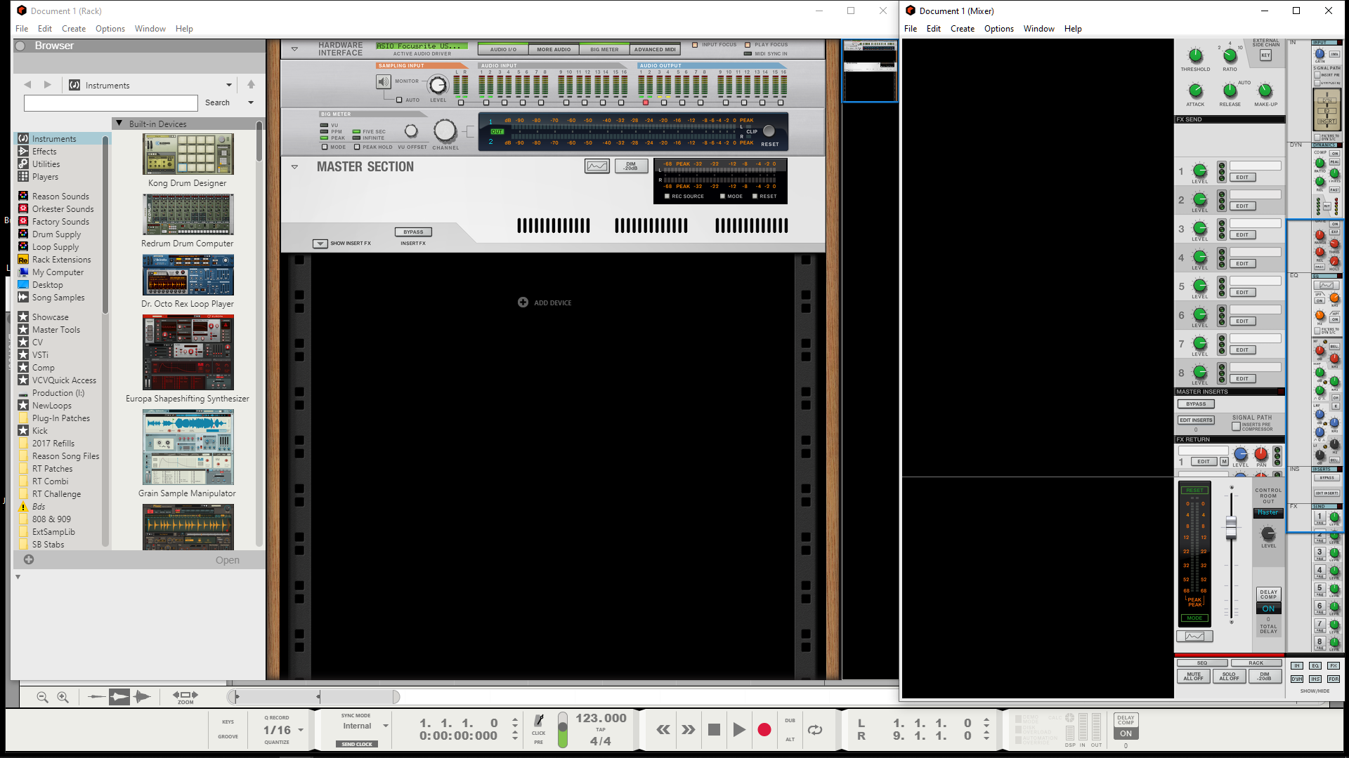
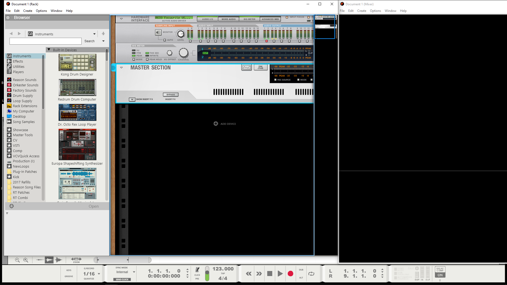
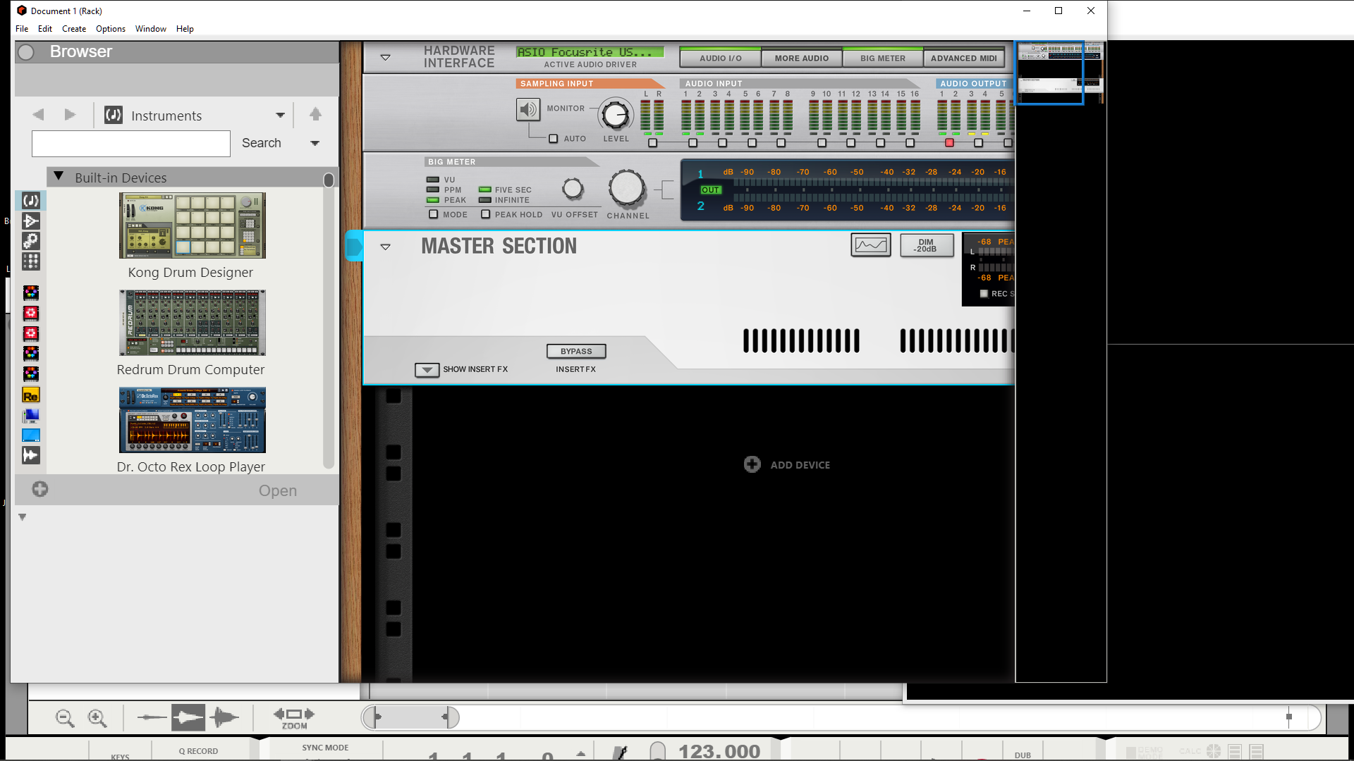
HD graphics, I have always seen as low priority, I really couldn't care less about them. There is plenty of other things that should have higher priority and in need of attention first from my own point of view. Some users have been fairly vocal on the matter if only they could put that energy into actual useful features. I just don't need to have my face pressed up against a screen to make music but others obviously do. Zoom just doesn't work.. You would expect it to be in a working order for a release. Here's what happens when I use zoom:
Default view

- ZoomDefault.png (737.52 KiB) Viewed 36313 times
110%

- Zoom110.png (489.8 KiB) Viewed 36313 times
160%

- Zoom160.png (579.89 KiB) Viewed 36313 times
Terrible! not useful one bit. Maybe I should go buy a 65" monitor to accommodate the scale. Most things don't align properly either like knobs and faders on devices. Some graphics have jagged edges on different zoom levels. How exactly am I supposed to use the mixer when it gets pushed off the screen?
It is not too much of an ask for people or things to be the best version of itself!
