VST2 in 9.5 came about a year after 9.0.
Reason 12.2.9 Release Notes
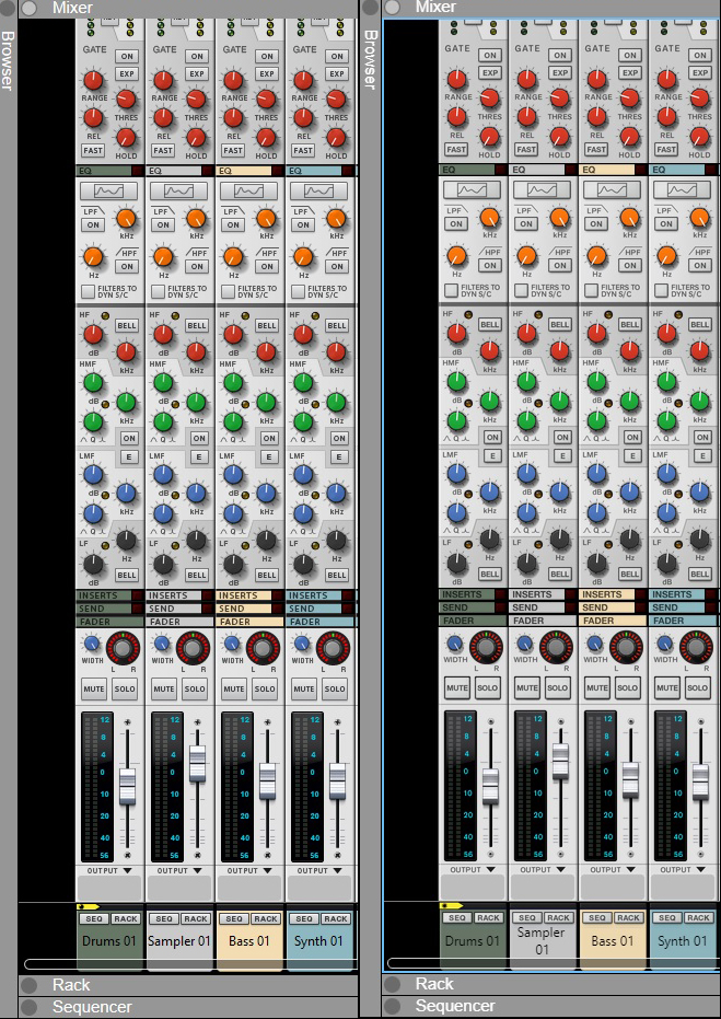
I have attached an image, maybe I'm being fussy but I was expecting high res to be better. left is 11, right is 12, you can see the fonts are not as crisp, the shadows (like mute solo) exaggerated, like a beginner in photoshop using the shadow effects for the first time and over exaggerating. The E of mute touching the right side. It's all small details but all combined, it looks worseselig wrote: ↑13 Oct 2022I don't run Windows but I've not heard other users experiencing what you describe - maybe some experienced Windows user can help here?mind2069 wrote: ↑12 Oct 2022Hi
I finally decided to install this version but is it just me, the SSL console looks worst, fonts are blurry, not crisp, fonts are too pale, shadows are exaggerated.
I was expecting it to look better. Same at other places but side by side comparison of the SSL, The buttons and fonts look awful. Just compare the sends section for example.
I guess it's the performance/functions that matters most but when there's such emphasis but on modernizing the UI, it should look better or at least equal.
The fonts all look blurry and and makes me think I need glasses, but when I go back to Reason 11, it's fine
It looks really amateur.
Why the hell did they not make the combinator full width.
Sorry for the rant but here the question:
I'm on a modern asus gaming with scale at regular 100%, is there some setting I am missing in Reason or Windows to at least make the fonts crisp?
Just look at all the fonts, inserts, send, fader, mute, solo, width, seq, rack, it's unfocused compared to 11, a little too pale or blurred
But thinking about it, maybe they don't really care about the DAW and rushed it.
I work in web UI and all margins, padding, font size ect makes a big difference in a final professional look and feel. Reason 11 SSL is a pleasure to look at, 12 not.
And I find looking at the Combinator not going full with, (leaving black bands on each side) very unpleasant to look at.
In the end, it's performance and functionality that matters, was hoping that 12 high res would of been a pleasure to look at.
But maybe I need a 4k screen?
Be sure to look at the image at pixel size

- EnochLight
- Moderator
- Posts: 8516
- Joined: 17 Jan 2015
- Location: Imladris
^^ THIS ^^
Also, I can't speak to 100% zoom as I haven't used it in forever. I always have Reason set to at least 140% zoom (in Reason), and the SSL looks fantastic IMHO:
# Miserable Degenerate | Win 10 | Ableton Live 11 Suite | Reason 13+ | i7 3770k @ 3.5 Ghz | 16 GB RAM | RME Babyface Pro | Akai MPC Live 2 & Akai Force | Roland System 8, MX1, TB3 | Dreadbox Typhon | Korg Minilogue XD
- Jackjackdaw
- Posts: 1468
- Joined: 12 Jan 2019
I didn’t realise Reason had its own zoom setting , I have always used Windows scaling , usually at 150% . I just did an A/B with Windows/Reason scaling and the results were much much better on my screen using Windows scaling and leaving Reason at 100%
All my scales are correct (windows and reason)
Just look at side by side on my image
The solo/mute buttons, text on Reason 12 is quite blurry compared to 11, makes me fell I need glasses, cant tell me you don't see the difference.
Plus the shadows are awful, but that's a taste matter.
All the small details are everywhere on the daw. The devices seems fine but I haven't look at the much yet, What jumped to my eyes immediately is the kong pad texts are not centered anymore.
Anyway, seems I will have no choice to adapt if I was vst3 and all other goodies. Disappointed but that's life.

- EnochLight
- Moderator
- Posts: 8516
- Joined: 17 Jan 2015
- Location: Imladris
You sure about that? Reason (scaled via Reason's options) at 150% looks crystal clear and high-def on a 1080p panel. If I set Reason to 100% (via Reason's options) and scale Windows to 150%, it's a pixelated mess.Jackjackdaw wrote: ↑13 Oct 2022I didn’t realise Reason had its own zoom setting , I have always used Windows scaling , usually at 150% . I just did an A/B with Windows/Reason scaling and the results were much much better on my screen using Windows scaling and leaving Reason at 100%
# Miserable Degenerate | Win 10 | Ableton Live 11 Suite | Reason 13+ | i7 3770k @ 3.5 Ghz | 16 GB RAM | RME Babyface Pro | Akai MPC Live 2 & Akai Force | Roland System 8, MX1, TB3 | Dreadbox Typhon | Korg Minilogue XD
- EnochLight
- Moderator
- Posts: 8516
- Joined: 17 Jan 2015
- Location: Imladris
I do agree in your example, the fonts on the right screen grab look thinner and less contrasty compared to the left, for sure. Is it enough to kill my productivity or make me ill? Nah. But I work at 140% zoom (or larger), so I couldn't bare to look at that small of a zoom level at 100% anyway.
Obviously YMMV...
# Miserable Degenerate | Win 10 | Ableton Live 11 Suite | Reason 13+ | i7 3770k @ 3.5 Ghz | 16 GB RAM | RME Babyface Pro | Akai MPC Live 2 & Akai Force | Roland System 8, MX1, TB3 | Dreadbox Typhon | Korg Minilogue XD
You're right that there are slight discrepancies here and there. I didn't notice them all until you pointed them out, but I do see them on my machine if I'm looking closely. I'm on a mac, so I doubt it's anything related to your configuration.mind2069 wrote: ↑13 Oct 2022I have attached an image, maybe I'm being fussy but I was expecting high res to be better. left is 11, right is 12, you can see the fonts are not as crisp, the shadows (like mute solo) exaggerated, like a beginner in photoshop using the shadow effects for the first time and over exaggerating. The E of mute touching the right side. It's all small details but all combined, it looks worse
Just look at all the fonts, inserts, send, fader, mute, solo, width, seq, rack, it's unfocused compared to 11, a little too pale or blurred
But thinking about it, maybe they don't really care about the DAW and rushed it.
I work in web UI and all margins, padding, font size ect makes a big difference in a final professional look and feel. Reason 11 SSL is a pleasure to look at, 12 not.
And I find looking at the Combinator not going full with, (leaving black bands on each side) very unpleasant to look at.
In the end, it's performance and functionality that matters, was hoping that 12 high res would of been a pleasure to look at.
But maybe I need a 4k screen?
Be sure to look at the image at pixel size
I wouldn't say the DAW work seems particularly rushed, as there have been similar issues on rack devices. The most glaring problems have been slowly fixed (like the OctoRex labeling with the latest update).
I know these types of things can be distracting, but it's probably best to try and keep perspective on the purpose of the software and how much this stuff really matters.
As for the Combinator... The rack was widened so that Combinators could be placed inside the mix channel inserts. However, the rack plugin is still the original width, since it doesn't use mix channels. The Combinator still needs to fit in the rack plugin, so it can't be full width.
I think this comes from the way they now handle the graphic bitmaps. In reason 11 They had skilfully crafted pixel accurate bitmaps for each element for a single resolution, but now in Reason 12 they ship the 5k-hires bitmaps and down scale them for all other resolutions. Even when using a very good scaling algorithm this still leads to a little more blur on high contrast elements like fonts. So at unity gain (100%) Reason 12 does not look as sharp. Basically high-res is only useful for high resolution screens and a degration for lower resolution displays.mind2069 wrote: ↑13 Oct 2022I have attached an image, maybe I'm being fussy but I was expecting high res to be better. left is 11, right is 12, you can see the fonts are not as crisp, the shadows (like mute solo) exaggerated, like a beginner in photoshop using the shadow effects for the first time and over exaggerating. The E of mute touching the right side. It's all small details but all combined, it looks worse
Just look at all the fonts, inserts, send, fader, mute, solo, width, seq, rack, it's unfocused compared to 11, a little too pale or blurred
- Jackjackdaw
- Posts: 1468
- Joined: 12 Jan 2019
Screenshots : Reason 160% zoom while windows is 100% on the left. Reason 100% while windows is 150% on the right.


- Attachments
-
- winreasonscale.png (819.55 KiB) Viewed 5617 times
Can I buy a high resolution screen (4k ?) and leave the settings at 100% and get crisp fonts. cause if only changing the screen works, I'll do it.jam-s wrote: ↑13 Oct 2022I think this comes from the way they now handle the graphic bitmaps. In reason 11 They had skilfully crafted pixel accurate bitmaps for each element for a single resolution, but now in Reason 12 they ship the 5k-hires bitmaps and down scale them for all other resolutions. Even when using a very good scaling algorithm this still leads to a little more blur on high contrast elements like fonts. So at unity gain (100%) Reason 12 does not look as sharp. Basically high-res is only useful for high resolution screens and a degration for lower resolution displays.mind2069 wrote: ↑13 Oct 2022I have attached an image, maybe I'm being fussy but I was expecting high res to be better. left is 11, right is 12, you can see the fonts are not as crisp, the shadows (like mute solo) exaggerated, like a beginner in photoshop using the shadow effects for the first time and over exaggerating. The E of mute touching the right side. It's all small details but all combined, it looks worse
Just look at all the fonts, inserts, send, fader, mute, solo, width, seq, rack, it's unfocused compared to 11, a little too pale or blurred
If you get a screen with higher resolution and the same size (thus more ppi), then at 100% the Mixer would be smaller (most likely too small thus you'd likely increase the zoom level to 120% to 160% then the interpolation algorithm has more pixels to down scale into and this should give sharper results. To get back to the pixel accurate bitmap you'd have to have a screen where you could have Reason at maximum application zoom and still have it at a reasonable size on screen to work with.
Best thing you could try is to put Reason on a laptop and then ask at a local store if you can try it on some different displays, so you can see for yourself, if the result is OK for you.
Starting to make sense now, I played with the zoom and starting at 160%, looks pretty good.jam-s wrote: ↑13 Oct 2022If you get a screen with higher resolution and the same size (thus more ppi), then at 100% the Mixer would be smaller (most likely too small thus you'd likely increase the zoom level to 120% to 160% then the interpolation algorithm has more pixels to down scale into and this should give sharper results. To get back to the pixel accurate bitmap you'd have to have a screen where you could have Reason at maximum application zoom and still have it at a reasonable size on screen to work with.
Best thing you could try is to put Reason on a laptop and then ask at a local store if you can try it on some different displays, so you can see for yourself, if the result is OK for you.
So if I get something like 28" 4K/UHD 3840 x 2160 and zoom it between 160% to 200%
I could get the same amount on my screen (current: 1920 * 1080 at 100%) and everything would be crisp
The catch
- Are vst compatible or will I get surprises when I pop open a VST
- Is there any audio performance loss for doing this?
- mimidancer
- Posts: 832
- Joined: 30 Sep 2021
we all don't know, but you can share if ya want.Biolumin3sc3nt wrote: ↑11 Oct 2022Wow, I guess there was a "Reason" for Me to wake up so damn early today : ) Finally 12.9 shows itself – from the beta
We all know what's still waiting tho...
Just installed this update and was getting choppy audio on my M1 MBP until I switched to single threaded audio. Had me worried for a sec!
Software: Reason 13 + Objekt, Vintage Vault 4, V-Collection 9 + Pigments, Vintage Verb + Supermassive
Hardware: M1 Mac mini + dual monitors, Launchkey 61, Scarlett 18i20, Rokit 6 monitors, AT4040 mic, DT-990 Pro phones
Hardware: M1 Mac mini + dual monitors, Launchkey 61, Scarlett 18i20, Rokit 6 monitors, AT4040 mic, DT-990 Pro phones
Windows has two scales (the general that affects all objects and the custom scaleling wich does not affect objects the samenand you can define any value. If you want 123% scale for example. ). In my experience since reason 12 you're better with 100% on windows's both scales and having reason managing zoom. That's the crisper settings I have in my system. If pulling the settings on windows Down to 100% does not yield results, I'd send an issue to RS support.mind2069 wrote: ↑13 Oct 2022All my scales are correct (windows and reason)
Just look at side by side on my image
The solo/mute buttons, text on Reason 12 is quite blurry compared to 11, makes me fell I need glasses, cant tell me you don't see the difference.
Plus the shadows are awful, but that's a taste matter.
All the small details are everywhere on the daw. The devices seems fine but I haven't look at the much yet, What jumped to my eyes immediately is the kong pad texts are not centered anymore.
Anyway, seems I will have no choice to adapt if I was vst3 and all other goodies. Disappointed but that's life.

Yes, vst2's are working with this version of reason as other versions. Vst3 is in the works but it's not yet in this version. And at graphical level you have a new setting to related to the vst rescaling/zoom so if you have size surprises you should check what is the best setting.
No, reason creates cashe on the first time you set a given zoom so there might be a slight cpu bump and you see stuff a bit fuzzy on the first iterations. This happens mostly at the rack and in the Re assets assuming all your Re's have the hi-res version installed. But once these are rendered there isn't more cpu use as R12 also passed a lot of gui rendering work to the gfx card.
That was not the questionmcatalao wrote: ↑14 Oct 2022Yes, vst2's are working with this version of reason as other versions. Vst3 is in the works but it's not yet in this version. And at graphical level you have a new setting to related to the vst rescaling/zoom so if you have size surprises you should check what is the best setting.
No, reason creates cashe on the first time you set a given zoom so there might be a slight cpu bump and you see stuff a bit fuzzy on the first iterations. This happens mostly at the rack and in the Re assets assuming all your Re's have the hi-res version installed. But once these are rendered there isn't more cpu use as R12 also passed a lot of gui rendering work to the gfx card.
If I buy a high ppi monitor (28" 4K/UHD 3840 x 2160), leave windows at 100% and scale in Reason, how do the vst's react, to the windows scaling or the reason scaling.
My first tests seems that the vst's scale to windows so the vst's will be too small if I go the high ppi screen with Reason scale to 160
Check the scalling/zooming setting on the vst window.mind2069 wrote: ↑14 Oct 2022That was not the questionmcatalao wrote: ↑14 Oct 2022
Yes, vst2's are working with this version of reason as other versions. Vst3 is in the works but it's not yet in this version. And at graphical level you have a new setting to related to the vst rescaling/zoom so if you have size surprises you should check what is the best setting.
No, reason creates cashe on the first time you set a given zoom so there might be a slight cpu bump and you see stuff a bit fuzzy on the first iterations. This happens mostly at the rack and in the Re assets assuming all your Re's have the hi-res version installed. But once these are rendered there isn't more cpu use as R12 also passed a lot of gui rendering work to the gfx card.
If I buy a high ppi monitor (28" 4K/UHD 3840 x 2160), leave windows at 100% and scale in Reason, how do the vst's react, to the windows scaling or the reason scaling.
My first tests seems that the vst's scale to windows so the vst's will be too small if I go the high ppi screen with Reason scale to 160
- EnochLight
- Moderator
- Posts: 8516
- Joined: 17 Jan 2015
- Location: Imladris
I always use the zoom/scaling of the actual VST (Windows set to 100%; Reason set to 140-160%). I don't think I have any VST that don't have a proper zoom setting. If any don't, they're far and few in between or I just don't use them these days.
@mind2069 - which VST's are you using that don't actually have their own zoom/scale setting?
# Miserable Degenerate | Win 10 | Ableton Live 11 Suite | Reason 13+ | i7 3770k @ 3.5 Ghz | 16 GB RAM | RME Babyface Pro | Akai MPC Live 2 & Akai Force | Roland System 8, MX1, TB3 | Dreadbox Typhon | Korg Minilogue XD
You are right, they pretty much all have scaling, did not often search for it cause most would open at a size I was happy with.EnochLight wrote: ↑14 Oct 2022I always use the zoom/scaling of the actual VST (Windows set to 100%; Reason set to 140-160%). I don't think I have any VST that don't have a proper zoom setting. If any don't, they're far and few in between or I just don't use them these days.
@mind2069 - which VST's are you using that don't actually have their own zoom/scale setting?
- JiggeryPokery
- RE Developer
- Posts: 1177
- Joined: 15 Jan 2015
Yes, and it's a bigger problem than simply older VSTs.mind2069 wrote: ↑14 Oct 2022
If I buy a high ppi monitor (28" 4K/UHD 3840 x 2160), leave windows at 100% and scale in Reason, how do the vst's react, to the windows scaling or the reason scaling.
My first tests seems that the vst's scale to windows so the vst's will be too small if I go the high ppi screen with Reason scale to 160
If using a UHD screen with Windows, you're not going to ever realistically be running Windows at 100%: everything in your Windows UI and all programs that use Windows scaling will just be comically tiny. Few would put up with switching Windows to and from say, 200% to 100% every time they want to use just Reason, especially as this assumes Reason would be the only program you need to use at any one time, which it probably won't be - want are you going to do with your File Explorer or Browser etc etc running alongside?
Who were these mythical madman RS talked of, using Windows on a 4K screen with display scaling set to 100%? Windows recommended setting in its Display Settings dialog for 4K screen is 300%
I do need to retest R12 on my 4K TV screen, I can't quite remember what happened when I tried it during the beta. I just seem to recall the transport bar being ridiculously stupid big.
post-script: I'm not at all sure this is correct, just something lurking in the back of my mind, someone can offer corrections, but my vague understanding at the time was that Apple and Windows system scalings are fundamentally different? Is it the case that for Mac 100% is always 100% of the given resolution, e.g. HD is 100%, and 4K is 100%, whereas Windows scaling is always relative to 100% HD, meaning UHD needs to be 300%? I wonder if this is where a lot of confusion about scaling is coming from?
Last edited by JiggeryPokery on 14 Oct 2022, edited 1 time in total.
If I'm not mistaken, it takes a while for the graphics to update after changing zoom for the first time - not sure that's what is happening here, but something to be aware of if you change to a higher zoom setting and things suddenly look worse.
FWIW, for comparison here's the latest version of 12 @ 110% (what I'm currently using on a new Mac monitor), and 100% (for good measure).


FWIW, for comparison here's the latest version of 12 @ 110% (what I'm currently using on a new Mac monitor), and 100% (for good measure).


Selig Audio, LLC
- JiggeryPokery
- RE Developer
- Posts: 1177
- Joined: 15 Jan 2015
Apart from the bit on the right that has has no scaling applied as I pointed out elsewhere a couple of days ago. Although to be fair, you do say the SSL specifically and pretend the entirely badly upscaled navigator (including show/hide buttons) doesn't exist. In which case, you probably should have cropped that bit
If the SSL section itself looks fine, what's your verdict on the SSL redrawing ? It's utterly pants here. If you've not tried it, just add a load of SubTs or whatever to a new document, more than will fill the mixer, and try to scroll. It's really laggy here
-
- Information
-
Who is online
Users browsing this forum: No registered users and 14 guests
