

This is how multi-lane selection is presented currently:
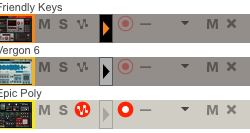
What that shows is this:
- The top two are selected to be viewed in multi-lane
- The bottom one is not
- The top-most one is selected for editing
But also imagine that amongst many tracks. And in order for it to function, you have to click in those boxes with the triangles, or else you lose your selections. However, those boxes are not inviting to be pressed. By just looking at them, I wouldn't know what they are. I don't have to look in the manual to know what "M" or "S" does. And the representation of the automation button is helpful too.
I'm proposing a couple solutions.
OPTION 1: Graphics that resemble what you see in the sequencer
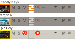
What that shows you:
- The color lines represent the notes you are editing (still using each track's color here)
- The grey lines are the 'ghosted' note lanes (like ghosted notes in the sequencer).
- And then the empty box is implied that you aren't seeing those notes at all
OPTION 2: Eye symbols indicating what you see
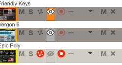
What that shows you:
- The color filled box with the open eye is what you are editing
- The grey box with the open eye is the ghost lane
- The eye with the strikethrough is the lane you don't see
What do you think? I think something could be done with the multi-lane edit selection to make it much more intuitive and I hope these inspire something. I like option 1—it's the most obvious and best type of representation IMO. I feel like you can look at that and know exactly what you're looking at and what it does.


 Join ReasonTalk on Slack!