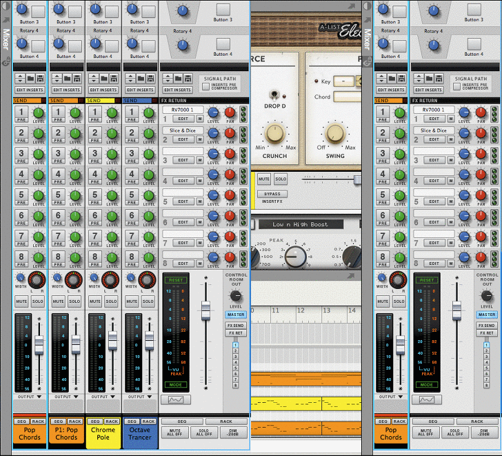
Option to rearrange attached windows/Mixer on bottom, to the right, etc
Personally, I'd never use something like this. I just use f5,f6, and f7 to toggle between the screens. I don't really see a need to have any of them open at the same time.
What bothers me most about the mixer is that it is so incredibly long and presents all its functions, even if you never need them all at once. I do not know how many kilometers I had to scroll back and forth to reach only the eq. a collapsible function would be so great.
Good idea. I personally never use the EQ knobs at all... I would appreciate the option to just click the eq Icon just above the channel faders.Noplan wrote: ↑04 Apr 2019What bothers me most about the mixer is that it is so incredibly long and presents all its functions, even if you never need them all at once. I do not know how many kilometers I had to scroll back and forth to reach only the eq. a collapsible function would be so great.
mixer.jpg
D.
There is a collapse featureNoplan wrote: ↑04 Apr 2019What bothers me most about the mixer is that it is so incredibly long and presents all its functions, even if you never need them all at once. I do not know how many kilometers I had to scroll back and forth to reach only the eq. a collapsible function would be so great.
mixer.jpg
the most embarassing moment in my live. seriously.joeyluck wrote: ↑04 Apr 2019There is a collapse featureNoplan wrote: ↑04 Apr 2019What bothers me most about the mixer is that it is so incredibly long and presents all its functions, even if you never need them all at once. I do not know how many kilometers I had to scroll back and forth to reach only the eq. a collapsible function would be so great.
mixer.jpgjust double click the section label.
It was really confusing me, because the picture you posted has sections collapsed.
I'm so stupid that I've cut this up in photoshop. let's just forget that. we finally have to put this thread on page 3, so that this misery has an end.
Haha yeah funny that you edited it to pretty much look like the way it functions now.
So you must love it!
Maybe I should quote your image another time...
D.
I'd like the ability to switch up the layouts as stated by OP.
The more you allow me set up a workstation I find most intuitive and easy to use the better I feel using your product. Using Reason is fun, no denying that. But Reason isn't customizable. At least not in its current state in my opinion.
The more you allow me set up a workstation I find most intuitive and easy to use the better I feel using your product. Using Reason is fun, no denying that. But Reason isn't customizable. At least not in its current state in my opinion.
I'd still really like to be able to place the Mixer at the bottom or to the right. Anybody else?
I don't really feel the need for having the mixer anywhere else. Of course all extra customization would be nice. Over the years I've tried working on multiple displays and even just a second one has me turning my head/neck or straining my eyes too much for my comfort.
For me it's just faster, easier and clearer to switch around with F5-F7 (or their combinations) on a single display.
For me it's just faster, easier and clearer to switch around with F5-F7 (or their combinations) on a single display.
I used to make music but now I just cry on these forums. @diippii.com
I wouldn't be a fan, in my opinion it would only get confusing also considering that this has worked this way like... forever. As someone else said: a function key is all it takes. And well... I do really enjoy being able to detach a section and them move it onto another monitor. I'm even somewhat wondering if this wouldn't validate replacing my old 4:3 monitor with a touch screen (which would make it easier to control the Reason mixer).
--- 
I vote for the Mixer on the side as an option with the spotlight function.
Reason, Nuendo, Studio One
https://soundcloud.com/user-404930848
https://soundcloud.com/user-404930848
The different arrangements would be options
Yeah on macOS I use each window in full screen mode and then I can just use my trackpad to swipe between them.WillyOD wrote: ↑11 Sep 2019I don't really feel the need for having the mixer anywhere else. Of course all extra customization would be nice. Over the years I've tried working on multiple displays and even just a second one has me turning my head/neck or straining my eyes too much for my comfort.
For me it's just faster, easier and clearer to switch around with F5-F7 (or their combinations) on a single display.
But also, there's times when I want to see the Instrument and the Mix channel or the Sequencer and the mix channel, or all of the above at the same time. And having the Mixer at the top seems to be the least helpful in those instances.
I was reminded of this in another thread.
I hadn't posted an image of how an spotlight/inspector function could work on the Mixer, when it can be placed on the side.
Could look something like this... You press the button (here I'm just using a view lock style icon) and then the Mixer window snaps to fit just the selected channel and the master.

I like the idea. of putting it on the bottom.
Reason, Nuendo, Studio One
https://soundcloud.com/user-404930848
https://soundcloud.com/user-404930848
I agree. I still like this option as well.
It feels more natural not only because the bottom is where the mixer is positioned in most all other DAWs, but also because faders of a console are closest to your hands.
Of course, when I work on separate displays, my window arrangement is different, but when having the windows combined, the current arrangement just feels weird. Also, I think expanding/showing the Mixer in single window view will behave and feel better when it's at the bottom.
I think I'm leaning more towards the side attached Mixer now, because I can see more of the channel strip and it offers a possible solution for having an inspector view. Also, it too naturally has the Mixer's faders starting at the bottom of the window (just off to the side). But if users have the ability to arrange the attached windows however they like, that's even better.
-
Journeyman
- Posts: 3
- Joined: 08 Jul 2020
That side arrangement is definitely helpful, you can see a large portion of the strip without having to scroll.
-
0pt1muspr1me
- Posts: 2
- Joined: 04 Sep 2024
i just jumped from 4 to 13 and the initial setup of all windows active is a scrolling mess, even with two monitors. function keys help but it's very different from what I was used to in the old version.
so yes, vertical split screen for rack and mixer would be great, iIm used to having the old mixer on top so having it on the bottom is not too intuitive, but I see no reason to not have an option.
so yes, vertical split screen for rack and mixer would be great, iIm used to having the old mixer on top so having it on the bottom is not too intuitive, but I see no reason to not have an option.
-
- Information
-
Who is online
Users browsing this forum: No registered users and 22 guests
