27 Jun 2015
To me, most REs to me are beautiful. Some devs have limited budget and just provide clear and concise information, and that's perfectly fine. This post is more about my do's and don'ts.
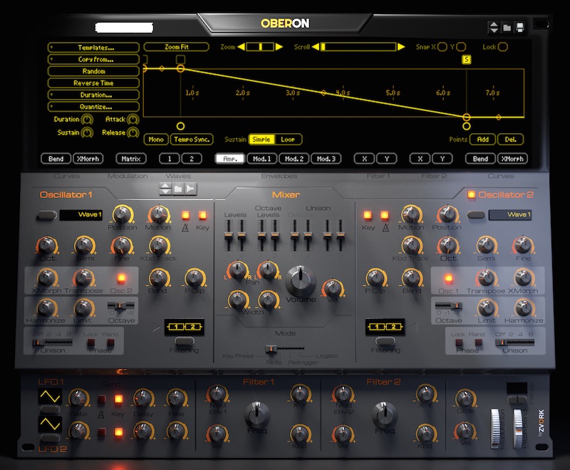
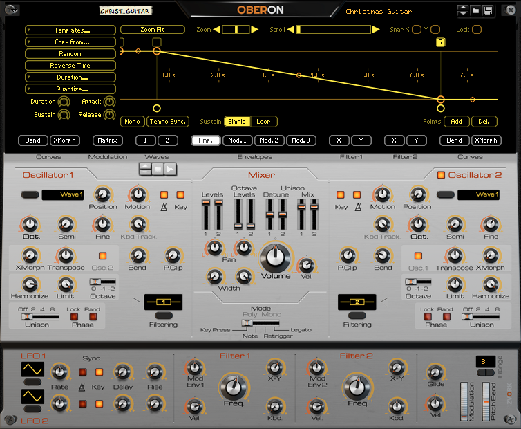
If you're going to have a complex RE with lots of controls, clear separation of the different elements is a must. Anything by Rob Papen is pretty nice in that area. Polar, Noxious and Etch Red does it quite nicely too. Parsec and Antidote are similar and unique, very different and it works! Even simple thick lines with curves edges like SubTractor and Ivoks is enough. Knobs in different colours or shapes is also a good option. Look at Eve MP5 above, it's the perfect example.
If you're going to have a big RE, put big knobs with clear writing on it. U-he and McDSP do that elegantly, so does Eve EQs. The one that I don't like is Radical Piano. So much wasted space, there is no need for it to have wide columns and a lonely volume knob. Parsec is too tall, could easily be just as tall as Antidote. (Screen real-estate is precious. I guess they're big and empty to give the illusion of being easy and simple to operate. Frankly, that's just less immediate info on my rack.)
If you're going to base the aesthetics of real gear or mimic legacy hardware, do it right. Most RE are gorgeous in that regard, but every time I look at Softube they all have something missing in my opinion.
Keep it consistent. For example, most patch save/load buttons and naming is at the top, often top-left. Radical Piano's is in the middle, C1-L1 is... at the bottom-right? For the sake of workflow, please don't do that.
On/off buttons (or Latch, or toggles) need to be clear. Personally, I love the glowing aura effect like on the SubTractor and 14:2 Mixer when buttons are active. They even depress, adding depth to visual feedback. C1-L1 has retro metal levers that translate badly into digital format and it's hard to see at a quick glance at which position they're at.
As much as I love glowing lights, Pulsar's glowing indicator is a bad implementation. Give me a volume bar that's bipolar, ReVolt and FET's voltage needle, anything is better than a flashing light.
Knobs! Fancy knobs are a nice added touch, but not necessary if you don't have the budget or talent. At the very least, give me a clear indication of the position. A long line, preferably thick, that goes in the middle of the knob is enough. I also really like a knob that gives me visual feedback when I'm turning it, like the little details around that spin when I turn it, and the shadows. The knobs I don't really like it Parsec's, they are insipid, dull and lack depth.
Even tiny knobs can be done right and can be beautiful pieces of art. Just pull out a 14:2 mixer and turn the send knobs. The contrasted detailing around the knob when you turn it, the spacing of the printed indicators around it, the shadowing on those printed indicators when you turn it at 3 o'clock, the reflection on the red plastic top, the subtle off-white colouring, the tasteful thickness of it... oh my god, it even has a watermark.
Numerical Sounds is uninspired. Quadelectra's CV Suite, just... no. I cite those that I don't like because most REs have I have nothing to complain about, in fact most are beautiful.
I quite like Mixfood Orange because it screams to me "I'm a SubTractor on steriods!", at least that's the way I use it. There's a list of things I think would improve it. pcb278, if you're interested I could post that list.


 Join ReasonTalk on Slack!