

The question then is: how to get clients when my portfolio doesn't have any Rack Extension design in it? Perhaps the best answer is to take a spin on the time-honored tradition of making an unsolicited redesign of an existing RE.
What follows is a little exercise in remaking the UI of a popular RE that I thought could use some more work to hit the level of the Propellerhead devices. The goal was to keep the layout and core concepts of the original, but improve navigability and balance while finessing the details.
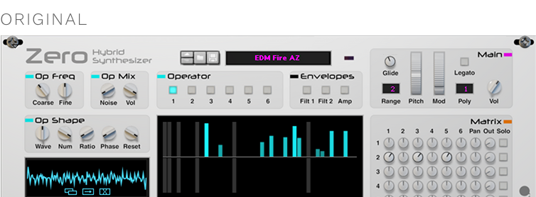
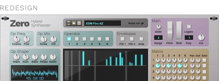
A few design notes:
- Typography: That font (Neuropol by Ray Larabie) is not well-suited to UI and doesn’t have multiple typographic weights. Instead, I used a neo-grotesk called Work Sans which allows greater flexibility and looks more professional.
- Contrast: Zero can be kind of a gray fog sometimes. I used brighter knobs and a darker background to make the interactive parts stand out more.
- Section dividers: The outlines end up looking noisy on a UI this complex, and the little color swatches add clutter as well as being easily mistaken for LEDs. Colored backgrounds, at just the right level of saturation, solve the noise problem while livening up the panel.
- Ghosted knobs: A mixing of metaphors, using a software pattern (ghosting) on a physically-styled interface. As an alternative, I’ve proposed knobs that light up when turned.


 Join ReasonTalk on Slack!