Page 1 of 4
The new GUI could be a make-or-break chance for Reason
Posted: 07 Dec 2020
by chaosroyale
They have the opportunity to re-make Reasons image as a much more attractive DAW.
They can unify the look and feel of the rack and DAW and main mixer, and fix all the mish-mash of different design styles that have accumulated over the years, making Reason look cheap, disunited, and out-of-date.
But I think they are going to fumble it. In fact I would bet they will do the following:
The addiction to conservatism and old-fashioned thinking that is the trademark of Reason, means they will keep all the old designs, regardless of how well they fit the GUI, instead of creating a coherent vision for the GUI. They will keep opposing design styles that conflict with each other.
"Original Reason" (Simplified Skeuo e.g. Subtractor. Europa actually went back to something like this style, which was nice.)
"Middle Reason" (overdone, gimmicky, "3D" Skeuo such as Audiomatic)
"Modern Reason 1" (semi-flat, colorful, "iphone App" style e.g. Players)
"Modern Reason 2 " (only partly flat, partly skeuo, oversized pastel panels with lots of dead space e.g. Quartet & Sweeper)
I know the old Grandpa's who wish Reason was frozen in time will complain if RS update anything, but the Reason Rack looks like a real cheesy mess now. It used to be so stylish and striking, with a unified aesthetic. Now it looks like a pile of mish-mashed plugins awkwardly attached to a flat DAW sequencer window.
They should choose a style and go with it. Maybe make everything super-sharp rendered skeuo style (for example like Ekssperimental Sounds with their Tape echo), OR make everything a semi-flat "app" style in gentle 21st century colors, or whatever. But choose a damn style, and carry it through the whole damn GUI. The previews we have seen so far suggest that nope, there will be no updating, just a 4k re-skin.
Re: The new GUI could be a make-or-break chance for Reason
Posted: 07 Dec 2020
by chaosroyale
Case in point: these 2 devices are from
the same GUI... are you fucking kidding me?
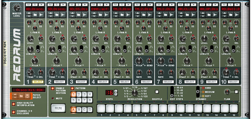
- Redrum.jpg (316.84 KiB) Viewed 3060 times
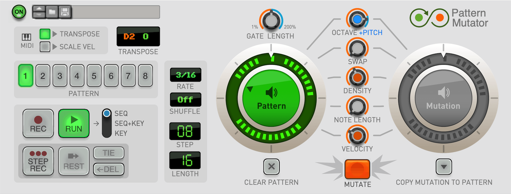
- device-patternmutator-front1-web_K86hbS8.png (703.25 KiB) Viewed 3060 times
Re: The new GUI could be a make-or-break chance for Reason
Posted: 07 Dec 2020
by DaveyG
A 4k reskin is exactly what we asked for...
Re: The new GUI could be a make-or-break chance for Reason
Posted: 07 Dec 2020
by aeox
They should've stuck to the redrum style of GUI. It's too late now though.
Whoever the guy on the forum was that mentioned new devices looking like fisher price toys.. nailed it!
Re: The new GUI could be a make-or-break chance for Reason
Posted: 07 Dec 2020
by chaosroyale
In 2010, maybe a 4K reskin would have been enough. But the new players and devices use a fundamentally different design language. Now it looks like 2 or 3 completely different GUI's jammed into one screen at the same time.
DaveyG wrote: ↑07 Dec 2020
A 4k reskin is exactly what we asked for...
Re: The new GUI could be a make-or-break chance for Reason
Posted: 07 Dec 2020
by guitfnky
not all real-world rackmount hardware looks the same. especially with stuff from different eras—that’s to be expected. why should Reason’s rack all look the same?
they do have a big opportunity to make some great, sweeping changes to the UI—mixer improvements, integrating the F8 and other floating windows, reworking the groove mixer, and any number of other ancillary areas—but the devices themselves are the very least of what needs updating.
Re: The new GUI could be a make-or-break chance for Reason
Posted: 07 Dec 2020
by antic604
aeox wrote: ↑07 Dec 2020
They should've stuck to the redrum style of GUI. It's too late now though.
While that would be awesome (IMO, of course) it's hard to be surprised that gradually introduced devices evolved in terms of style and GUI language over 20 years. Pick any other DAW to see that: Logic, Cubase, even Live that would seem to be immune to this due to its ascetic design.
And while this would be a great opportunity to re-do some of the newer devices (Players, Scenic) I don't see this happening for hundreds of REs, where the variety of designs - and their quality - is even bigger.
I guess we need to trust RE now and also don't expect they'll do both (high-res, GPU accelerated GUI *and* re-design) at the same time. Much bigger and more resource-rich companies like Apple, Steinberg or Ableton only very recently started updating their old devices to more modern designs, so maybe time will come for Reason, too.
Re: The new GUI could be a make-or-break chance for Reason
Posted: 07 Dec 2020
by Loque
Well, i am not a "old grandpa" as you said... And using aggressive and bad words does not improve your arguing position...

I am not a fan of ever changing UIs at all. Nearly every time i open some applications, they have a new UI, changing everything, and i need to look for functions i daily use. Often the UI changes made things terrible and tend to look just "fancy". Such changes does not bring everything to workflow.
I agree, that a unified UI is a good thing. But if everything looks the same, its harder to find the thing you are currently looking for. So make need to make a balanced decision.
Regarding the future, if i had to make the decision, i would change the rendering system to be prepared for the future, but leave it look like all users are used to, maybe with a few small tweaks here and there.
In a second step or ongoing process, i would change the UI in the direction that fits the users need, my (company) vision and place the product in the market...
Re: The new GUI could be a make-or-break chance for Reason
Posted: 07 Dec 2020
by chaosroyale
You are totally misunderstanding. I am not talking about something as superficial as "70s style colors on synths vs 80s style colors on synths". Did you look at those 2 devices above? They don't look like "different devices", they look like they come from
completely different GUIs.
A GUis design language informs everything. For example - is a "knob" really a round thing? Do you move the mouse up-and-down or round-and-round to move the knob?? Is a button supposed to work like a physical "object", or are buttons simply abstract areas on a flat plane? etc.
Also, Reason IS from one manufacturer, and is being redesigned in one era, so a unified look is quite a reasonable expectation. LIVE has managed it all this time (I hate the look of LIVE, but at least it has a look).
guitfnky wrote: ↑07 Dec 2020
not all real-world rackmount hardware looks the same. especially with stuff from different eras—that’s to be expected. why should Reason’s rack all look the same?
they do have a big opportunity to make some great, sweeping changes to the UI—mixer improvements, integrating the F8 and other floating windows, reworking the groove mixer, and any number of other ancillary areas—but the devices themselves are the very least of what needs updating.
Re: The new GUI could be a make-or-break chance for Reason
Posted: 07 Dec 2020
by visheshl
well i prefer the mish mashed look of reason. like someone said its like a hardware rack,in which modules from different eras live together.
and if fact you can decipher which are the new plugins and which are the old ones just by looking at them. which i think is a great thing.
also with all the different REs on the shop made by different developers with different gui tastes, it will be impossible to have a unified look.
unless Reason studios impose their design style on RE developers.
i dont think thats going to happen.
anyway, i just wanted ti say that reason looks great to me as it is. it does not need a unified gui.
Re: The new GUI could be a make-or-break chance for Reason
Posted: 07 Dec 2020
by guitfnky
chaosroyale wrote: ↑07 Dec 2020
You are totally misunderstanding. I am not talking about something as superficial as "70s style colors on synths vs 80s style colors on synths". Did you look at those 2 devices above? They don't look like "different devices", they look like they come from
completely different GUIs.
A GUis design language informs everything. For example - is a "knob" really a round thing? Do you move the mouse up-and-down or round-and-round to move the knob?? Is a button supposed to work like a physical "object", or are buttons simply abstract areas on a flat plane? etc.
Also, Reason IS from one manufacturer, and is being redesigned in one era, so a unified look is quite a reasonable expectation. LIVE has managed it all this time (I hate the look of LIVE, but at least it has a look).
guitfnky wrote: ↑07 Dec 2020
not all real-world rackmount hardware looks the same. especially with stuff from different eras—that’s to be expected. why should Reason’s rack all look the same?
they do have a big opportunity to make some great, sweeping changes to the UI—mixer improvements, integrating the F8 and other floating windows, reworking the groove mixer, and any number of other ancillary areas—but the devices themselves are the very least of what needs updating.
I suspect I understand what you’re saying quite well—I wasn’t the one to mention “color style”. when you say GUI/UI, I take you at your word that’s what you mean.
the devices were created in different eras for an evolving user base with evolving tastes, who use them for different purposes. it’s not surprising that stuff coming out in 2020 looks very different than the more classic looks of devices from earlier versions. look at a Teenage Engineering synth vs an old Moog or something—very different. if they both were in the same real-world rack, would we have a problem with that as well? I suspect not.
Re: The new GUI could be a make-or-break chance for Reason
Posted: 07 Dec 2020
by chaosroyale
I don't think so.. I am not talking about a moog looking different from T.E.
You could make a unified GUI with a flat Moog and a flat T.E. Or you could make a GUI with a Skeuo Moog and a Skeuo T.E.
No problem.
But Reason puts "3d moog" and "flat moog" and "cartoon moog", all next to each other.
guitfnky wrote: ↑07 Dec 2020
I suspect I understand what you’re saying quite well
Re: The new GUI could be a make-or-break chance for Reason
Posted: 07 Dec 2020
by chaosroyale
As for 3rd party RE's, of course they do not have a unified look, that's irrelevant to my point. I am talking about the main DAW.
Re: The new GUI could be a make-or-break chance for Reason
Posted: 07 Dec 2020
by guitfnky
chaosroyale wrote: ↑07 Dec 2020
I don't think so.. I am not talking about a moog looking different from T.E.
You could make a unified GUI with a flat Moog and a flat T.E. Or you could make a GUI with a Skeuo Moog and a Skeuo T.E.
No problem.
But Reason puts "3d moog" and "flat moog" and "cartoon moog", all next to each other.
guitfnky wrote: ↑07 Dec 2020
I suspect I understand what you’re saying quite well
none of these devices are “flat”. they’ve got flatter buttons and flatter colors, but none are “flat”.
some elements may be in 2D, but technology allows for that in the real world now (flat LCD displays on devices, etc.), so I don’t see the issue.
Re: The new GUI could be a make-or-break chance for Reason
Posted: 07 Dec 2020
by guitfnky
chaosroyale wrote: ↑07 Dec 2020
As for 3rd party RE's,
of course they do not have a unified look, that's irrelevant to my point. I am talking about the main DAW.
you’re really only talking about the rack, not the DAW.
Re: The new GUI could be a make-or-break chance for Reason
Posted: 07 Dec 2020
by deeplink
Surely the best way around this all would be to make the all the devices skinabble? "New in the Reason Shop..."
Re: The new GUI could be a make-or-break chance for Reason
Posted: 07 Dec 2020
by Creativemind
aeox wrote: ↑07 Dec 2020
They should've stuck to the redrum style of GUI. It's too late now though.
Whoever the guy on the forum was that mentioned new devices looking like fisher price toys.. nailed it!
That's a good way of describing them. They do a bit. I think the Players are just about ok (but the latest one isn't great) with me visually but not a fan of the sample area with them flags on Grain.
Re: The new GUI could be a make-or-break chance for Reason
Posted: 07 Dec 2020
by guitfnky
Grain is the best looking device in the whole app.

Re: The new GUI could be a make-or-break chance for Reason
Posted: 07 Dec 2020
by chaosroyale
I am talking about the whole DAW, not only the rack (although the rack is the easiest part to see). Remember when the transport bar used the same design style as the rack? Now its some weird flat thing.
As for "flat" devices - look at the example I posted above. The player device is mostly flat with some stylized cartoon "shading" to give it some depth, but it is clearly not existing in the same space as the skeuomorphic Redrum.
Everyone (not just you, I'm not blaming you) is talking about this as if it is "different designs of devices in the rack" like "moog looks different to yamaha". That's not the problem.
How can I explain. Europa looks more "modern" than Subtractor and Redrum but they are all in the same GUI style. Even though Europa has a "screen" and is much bigger. They all follow the same logic and design rules. They are all skeuo-but-simple-and-not-overly-3d. Europa takes advantage of more space, but Redrum and Subtractor could be updated to be less cramped while keeping the same design philosophy.
However, too many parts of the rack and the DAW use fundamentally different GUI philosophies. To exaggerate, its a bit like playing animal crossing but parts of the screen are rendered like "super mario kart" and parts are rendered like "god of war". It doesn't make any sense.
guitfnky wrote: ↑07 Dec 2020
chaosroyale wrote: ↑07 Dec 2020
As for 3rd party RE's,
of course they do not have a unified look, that's irrelevant to my point. I am talking about the main DAW.
you’re really only talking about the rack, not the DAW.
Re: The new GUI could be a make-or-break chance for Reason
Posted: 07 Dec 2020
by Creativemind
guitfnky wrote: ↑07 Dec 2020
not all real-world rackmount hardware looks the same. especially with stuff from different eras—that’s to be expected. why should Reason’s rack all look the same?
they do have a big opportunity to make some great, sweeping changes to the UI—mixer improvements, integrating the F8 and other floating windows, reworking the groove mixer, and any number of other ancillary areas—but the devices themselves are the very least of what needs updating.
Because you're talking about hardware from many many different companies not the whole paradigm of a daw being slick and act like they're part of the same thing.
And my guess is, everything in your last paragraph + the opportunity to add scalability and another theme or 2 (that also can be applied to the menu's / mixer and no restart required to apply) will all be ignored. They to me all tie in together as they're all visual / graphics based. They could also update the graphics on the midi editor piano and make it look really good like some vst ones look but doubt they will. It's like when it comes to slick and great functionality or innovation to the daw itself, they have either no a) intention, b) see any of this as an issue for some bizarre reason or c) have no vision functionality-wise.
Re: The new GUI could be a make-or-break chance for Reason
Posted: 07 Dec 2020
by miscend
They're sticking to the spirit of the original designs as we have already seen in the sneak preview. Nothing is going to change in the design language. The skeuomorphic vintage device look is now tradition, if you want something else go to Ableton or Bitwig.
Re: The new GUI could be a make-or-break chance for Reason
Posted: 07 Dec 2020
by chaosroyale
Also, I personally hate flat designs, but I would be happy if RS just told me to fuck off and said "EVERYTHING will be cartoon style like pattern mutator" and then made the whole GUI actually look coherent. At least they would be going in a direction.
Re: The new GUI could be a make-or-break chance for Reason
Posted: 07 Dec 2020
by chaosroyale
My whole point is that the recent devices are not vintage skeuo, and we have several different types of GUI side-by-side in Reason now.
I want them to choose one. I would be very happy with the old "simplified skeuo" they used to do, but I think the bigger problem is that they simply do not have a design vision for Reason any more.
miscend wrote: ↑07 Dec 2020
They're sticking to the spirit of the original designs as we have already seen in the sneak preview. Nothing is going to change in the design language. The skeuomorphic vintage device look is now tradition, if you want something else go to Ableton or Bitwig.
Re: The new GUI could be a make-or-break chance for Reason
Posted: 07 Dec 2020
by Neo
Any UI refresh will be welcomed, even if its subtle as teased in the "Goodie Bag"
https://www.reasonstudios.com/blog/20-years-of-reason
New REs remind me of what Waves have done with Renaissance.
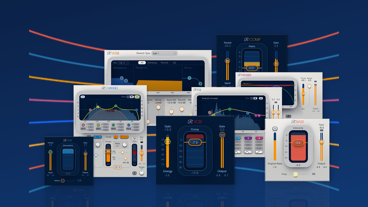
- renaissance-v11.jpg (333.07 KiB) Viewed 2907 times
Re: The new GUI could be a make-or-break chance for Reason
Posted: 07 Dec 2020
by guitfnky
chaosroyale wrote: ↑07 Dec 2020
I am talking about the whole DAW, not only the rack (although the rack is the easiest part to see). Remember when the transport bar used the same design style as the rack? Now its some weird flat thing.
As for "flat" devices - look at the example I posted above. The player device is mostly flat with some stylized cartoon "shading" to give it some depth, but it is clearly not existing in the same space as the skeuomorphic Redrum.
Everyone (not just you, I'm not blaming you) is talking about this as if it is "different designs of devices in the rack" like "moog looks different to yamaha". That's not the problem.
How can I explain. Europa looks more "modern" than Subtractor and Redrum but they are all in the same GUI style. Even though Europa has a "screen" and is much bigger. They all follow the same logic and design rules. They are all skeuo-but-simple-and-not-overly-3d. Europa takes advantage of more space, but Redrum and Subtractor could be updated to be less cramped while keeping the same design philosophy.
However, too many parts of the rack and the DAW use fundamentally different GUI philosophies. To exaggerate, its a bit like playing animal crossing but parts of the screen are rendered like "super mario kart" and parts are rendered like "god of war". It doesn't make any sense.
guitfnky wrote: ↑07 Dec 2020
you’re really only talking about the rack, not the DAW.
it doesn’t surprise me that they use different design philosophies for different devices. as others have pointed out, that can be seen as a feature, not a bug.
my point with the flatness comment is that different real world materials will look different rendered in 3D, and then displayed in 2D. and different shapes will also look different when rendered in 3D. an old LED indicator looks different than a newer indicator with more uniform lighting behind it. a flatter button *seems* less skeuomorphic than one with an indent in it, even if they’re both in 3D. the fact that they’re being presented in 2D makes one seem much flatter than the other, even if there is just as much depth there.
they’re all skeuomorphic—they’re just representing vastly different styles of what could easily be real-world devices. but again, the design style can make something seem flatter than it actually is.
