
What's Happened To the ReGroove Mixer?

Ditto also, I prefer the new appearance
-
Creativemind
- Posts: 4876
- Joined: 17 Jan 2015
- Location: Stoke-On-Trent, England, UK
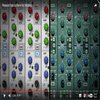
I know, how can a really nice looking well designed 3D ReGroove Mixer look as nice as that really flat grey uninspiring Ableton looking new one we have now.guitfnky wrote: ↑11 Aug 2021not gonna lie--I question the sanity of anyone who prefers the OLD look of the regroove mixer. the ugliest goddamn thing in all of Reason, by an easy mile (and that's really saying something, considering some of the older devices). need to get y'all's eyes checked. no accounting for taste, I guess.

Reason Studio's 11.3 / Cockos Reaper 6.82 / Cakewalk By Bandlab / Orion 8.6
http://soundcloud.com/creativemind75/iv ... soul-mix-3

I like the new design, more in line with the whole sequencer. For me it is more consistent now. The sequencer flat design and all the audio/rack stuff skeuomorphic.

if you feel inspired looking at that hideous old thing, I don't even have words. guess you must pine for the golden age of web design too... https://edit.co.uk/blog/top-10-worst-websites/Creativemind wrote: ↑12 Aug 2021I know, how can a really nice looking well designed 3D ReGroove Mixer look as nice as that really flat grey uninspiring Ableton looking new one we have now.guitfnky wrote: ↑11 Aug 2021not gonna lie--I question the sanity of anyone who prefers the OLD look of the regroove mixer. the ugliest goddamn thing in all of Reason, by an easy mile (and that's really saying something, considering some of the older devices). need to get y'all's eyes checked. no accounting for taste, I guess.
it would be a good ideajoeyluck wrote: ↑11 Aug 2021I think it's ok for the ReGroove Mixer. I wish the little "LEDs" above the knobs when activated were easier to see.
I'd also really like it if they would move the Groove settings from the Tool Window into the ReGroove mixer area. There'a a TON of empty space to fill there.
Tool Window.png
ReGroove Settings.png
I don't care much for any of those either, but they all look better than the old regroove mixer. hell, even Ableton, at its ugliest, with its worst possible theme looks better than the old regroove.Edin_16 wrote: ↑12 Aug 2021Here are some more "flat" designs:guitfnky wrote: ↑12 Aug 2021
if you feel inspired looking at that hideous old thing, I don't even have words. guess you must pine for the golden age of web design too... https://edit.co.uk/blog/top-10-worst-websites/
https://dribbble.com/tags/flat_ui
I dont like it, that the App-Look is taking over on everything. I hope really ReasoStudios continue to design devices that look like real hardware devices and not this Ableton/Bitwig flat stuff that you see everywhere...
everybody I showed reason (a lot of perople really don't know reason nomore nowdays because of their bad markedting ) are "whoooaw, that looks nice, great devices"
-
BonsaiMacKay

- Posts: 123
- Joined: 18 Jan 2015
- Location: A sane place
The ReGroove Mixer was introduced in R4 back in 2007 when its design was consistent with the transport bar. They updated the transport bar in R8 in 2014. I think it was about time they made the whole area consistent. The design could have been better, IMHO, but it is at least consistent now, and Joey has a made a great point there. Who knows, in another 14 years they might improve it again.
-
RobBarnett
- Posts: 115
- Joined: 15 Jul 2015
- Location: Wirral, UK
This is a fantastic idea. Always baffled me why you had to use 2 windows to configure groovesjoeyluck wrote: ↑11 Aug 2021I think it's ok for the ReGroove Mixer. I wish the little "LEDs" above the knobs when activated were easier to see.
I'd also really like it if they would move the Groove settings from the Tool Window into the ReGroove mixer area. There'a a TON of empty space to fill there.
Tool Window.png
ReGroove Settings.png
-
BonsaiMacKay
- Posts: 123
- Joined: 18 Jan 2015
- Location: A sane place
It made sense 14 years ago in R4 when Reason looked like this and ReGroove occupied the whole space from left to right above the transport bar:RobBarnett wrote: ↑12 Aug 2021This is a fantastic idea. Always baffled me why you had to use 2 windows to configure groovesjoeyluck wrote: ↑11 Aug 2021I think it's ok for the ReGroove Mixer. I wish the little "LEDs" above the knobs when activated were easier to see.
I'd also really like it if they would move the Groove settings from the Tool Window into the ReGroove mixer area. There'a a TON of empty space to fill there.
Tool Window.png
ReGroove Settings.png
They should have updated it 7 years ago along with the rest.

I too like better the new look but then again I will never see it because I never used it ever in a song
-
Creativemind
- Posts: 4876
- Joined: 17 Jan 2015
- Location: Stoke-On-Trent, England, UK
No, those websites are naff. Lol!guitfnky wrote: ↑12 Aug 2021if you feel inspired looking at that hideous old thing, I don't even have words. guess you must pine for the golden age of web design too... https://edit.co.uk/blog/top-10-worst-websites/Creativemind wrote: ↑12 Aug 2021
I know, how can a really nice looking well designed 3D ReGroove Mixer look as nice as that really flat grey uninspiring Ableton looking new one we have now.
I've turned this thread into a poll now as well.
Reason Studio's 11.3 / Cockos Reaper 6.82 / Cakewalk By Bandlab / Orion 8.6
http://soundcloud.com/creativemind75/iv ... soul-mix-3
-
Creativemind
- Posts: 4876
- Joined: 17 Jan 2015
- Location: Stoke-On-Trent, England, UK
I've only just noticed that some of the parameters on Mimic don't match the others graphically. No uniformity within the device. The stretch parameters should be the same graphic as the others. Not sure what those lines represent in the Comp either. They look more like EQ curves.Edin_16 wrote: ↑12 Aug 2021Ok youre right, it makes mybe more sense at the bottom of the sequencer, because its part of it and so it has to look the same. Sounds logical. But I reaslised that there are more amd more logical errors in the design of the new dvices. For example Mimic has some errors, I marked them red. It shoul be like the green marked areas, where its clear that there is a display. The red maked ared very unrealistic, becaus its neither a display nor an analog knob/button/fader so logicalle they are impossible to be dynamic.
OK, the reset button, I dont know, maybe its a button and I am wrong with the red marker.
sfsfsfs.jpg
One of the problems with the ReGroove mixer change though (yes it matches more with the graphics of the transport etc) is not only do I think the old design looks better but there's an element of it's what you're used to seeing it look like, why would it be changed? it's a backwards step seeing as the whole point of the hi-res I thought, was to improve things, there were some issues with the hi-res I'm guessing?
Last edited by Creativemind on 12 Aug 2021, edited 1 time in total.
Reason Studio's 11.3 / Cockos Reaper 6.82 / Cakewalk By Bandlab / Orion 8.6
http://soundcloud.com/creativemind75/iv ... soul-mix-3
maybe they hired a new graphic designer half way because it sure looks like someone who is not consistent in their design choicesEdin_16 wrote: ↑12 Aug 2021Ok youre right, it makes mybe more sense at the bottom of the sequencer, because its part of it and so it has to look the same. Sounds logical. But I reaslised that there are more amd more logical errors in the design of the new dvices. For example Mimic has some errors, I marked them red. It shoul be like the green marked areas, where its clear that there is a display. The red maked ared very unrealistic, becaus its neither a display nor an analog knob/button/fader so logicalle they are impossible to be dynamic.
OK, the reset button, I dont know, maybe its a button and I am wrong with the red marker.
sfsfsfs.jpg
-
Creativemind
- Posts: 4876
- Joined: 17 Jan 2015
- Location: Stoke-On-Trent, England, UK
Possibly. The designer must have been poached from the Ableton design team.gullum wrote: ↑12 Aug 2021maybe they hired a new graphic designer half way because it sure looks like someone who is not consistent in their design choicesEdin_16 wrote: ↑12 Aug 2021
Ok youre right, it makes mybe more sense at the bottom of the sequencer, because its part of it and so it has to look the same. Sounds logical. But I reaslised that there are more amd more logical errors in the design of the new dvices. For example Mimic has some errors, I marked them red. It shoul be like the green marked areas, where its clear that there is a display. The red maked ared very unrealistic, becaus its neither a display nor an analog knob/button/fader so logicalle they are impossible to be dynamic.
OK, the reset button, I dont know, maybe its a button and I am wrong with the red marker.
sfsfsfs.jpg
Can't understand the poll results here. Why would anyone like a dot in an oblong slider type thing over a graphic that looks like a proper mixer fader with incrementations and nice looking led light displays. Not to mention the dingey grey colour and flat design.. Don't get it. Would people like that design on the Main Mixer?
Reason Studio's 11.3 / Cockos Reaper 6.82 / Cakewalk By Bandlab / Orion 8.6
http://soundcloud.com/creativemind75/iv ... soul-mix-3
don’t understand the poll results? people don’t like dumpy shit that looks like grandpa drew it in MS Paint back in ‘93. pretty simple.
Also the contrast with that grey on grey is far worse then before, but I guess UI designers come from the "50 shades of grey fan-club" nowadays. (Another feat of those is to dumb down buttons into grey scale and an abstract icon so the eye has no easy visual cue as to quickly find the button with the right function.)Creativemind wrote: ↑12 Aug 2021Can't understand the poll results here. Why would anyone like a dot in an oblong slider type thing over a graphic that looks like a proper mixer fader with incrementations and nice looking led light displays. Not to mention the dingey grey colour and flat design.. Don't get it. Would people like that design on the Main Mixer?

Can't speak for anyone else but for me it is that it isn't ugly anymore.Creativemind wrote: ↑12 Aug 2021Can't understand the poll results here. Why would anyone like a dot in an oblong slider type thing over a graphic that looks like a proper mixer fader with incrementations and nice looking led light displays. Not to mention the dingey grey colour and flat design.. Don't get it. Would people like that design on the Main Mixer?

Agreed. It's attached to the sequencer window after all. The old ReGroove Mixer matched the old transport. It just didn't fit any more. It's not my favorite, but it is better.

I haven't voted because there is no option for "Not Bovvered".
A much more interesting poll would be "Do you ever use the regroove mixer?"
Or "Have you ever noticed that tiny button thing at the the bottom of the screen that says 'Groove' and did you know you can click it?"
Or even "Did you know there is a regroove mixer?"
The new look seems to have taken it from "old and outdated" to "too much like Live" but not so much like most other elements of Reason. Maybe other stuff will gradually be revamped to match. I still won't be that bothered though!
yeah, the look is much better now, but until they make it more useful, there’s kinda not much point.

-
fieldframe

- RE Developer
- Posts: 1037
- Joined: 19 Apr 2016
It's not ugly because it's flat; it's ugly because the spacing between all the elements is still based on the hardware-style version. It looks kind of half-done.
-
Creativemind
- Posts: 4876
- Joined: 17 Jan 2015
- Location: Stoke-On-Trent, England, UK
If any other elements in Reason adopt that design it will seal the deal of me never using it stand-alone again. Live is the horriblest looking daw going, worse than Reaper without a theme.DaveyG wrote: ↑12 Aug 2021I haven't voted because there is no option for "Not Bovvered".
A much more interesting poll would be "Do you ever use the regroove mixer?"
Or "Have you ever noticed that tiny button thing at the the bottom of the screen that says 'Groove' and did you know you can click it?"
Or even "Did you know there is a regroove mixer?"
The new look seems to have taken it from "old and outdated" to "too much like Live" but not so much like most other elements of Reason. Maybe other stuff will gradually be revamped to match. I still won't be that bothered though!
Most of those things you mentioned as well are not relevant to this thread. Yes I knew it was there, for getting decent swing in a house beat, it's essential.
Reason Studio's 11.3 / Cockos Reaper 6.82 / Cakewalk By Bandlab / Orion 8.6
http://soundcloud.com/creativemind75/iv ... soul-mix-3

At first, I didn't like the new look and then it quickly grew on me. I don't really care for the fader though. I could probably count the number of times I've used Regroover on one hand. I handle as much as I possibly can within the sequencer.
Relax. Listen to some music.
https://soundcloud.com/officialstrangers
https://soundcloud.com/areweghosts
https://officialstrangers.bandcamp.com/releases
https://soundcloud.com/officialstrangers
https://soundcloud.com/areweghosts
https://officialstrangers.bandcamp.com/releases
-
- Information
-
Who is online
Users browsing this forum: No registered users and 114 guests
 Join ReasonTalk on Slack!