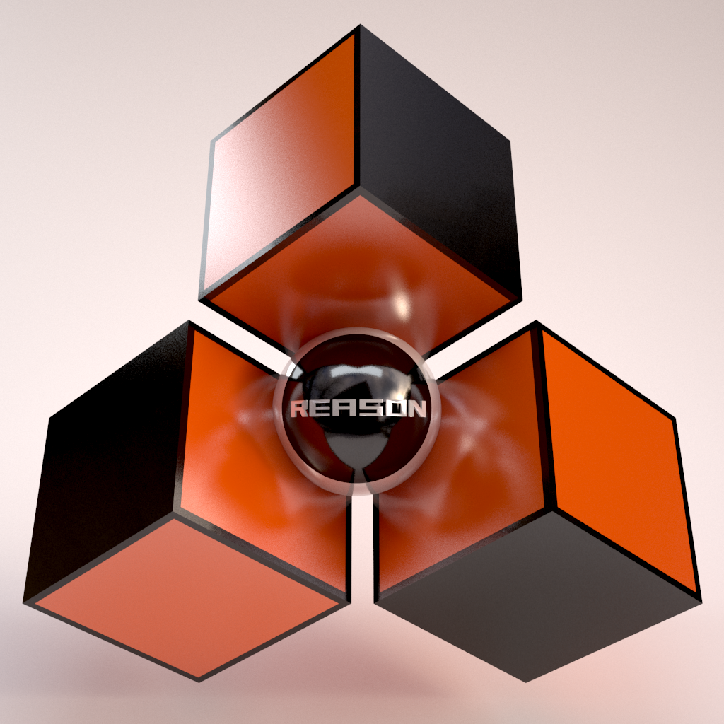
what do you think of the reason logo (should they change it)

This forum is for anything not Reason related, if you just want to talk about other stuff. Please keep it friendly!

Should they change the reason logo ?

yes it looks old now
4
17%
yes but they must keep the base thing
4
17%
yes make it a vagina
2
8%
no, never
12
50%
I don't care
2
8%
 
Total votes: 24
siln
Posts: 349
Joined: 11 May 2015
Location: france

09 Jun 2017

let me rephrase my previous thread, because I think it can be interesting
Ernst said in 2010 or so that they are thinking to maybe change this logo , but due to some people having it tatooed maybe it became iconic (something like that).
How do you like the reason logo? what does it mean/represent for you ? do u think they should change it?
and optionally do someone knows about its history , who created it and the meaning of it
as said it can relate to saturn more or less , the cubes reminds me also some iq test and the color was stealed from a bird robin (imo ;) )
but ultimately it reminds me of Penrose stairs Penrose triangle
personnally they could change it it wouldnt bother me , but this three cube thing is catchy
Attachments
Reason_logo.jpg
Reason_logo.jpg (26 KiB) Viewed 3316 times
Last edited by siln on 13 Jun 2017, edited 1 time in total.

siln
Posts: 349
Joined: 11 May 2015
Location: france

13 Jun 2017

I up the thread since I added a few things

User avatar
jonheal
Posts: 1213
Joined: 29 Jan 2015
Location: Springfield, VA, USA
Contact:

13 Jun 2017

It's not my favorite logo in the world, but no, they should not change it.

Coca Cola should not change theirs. Ford should not change theirs. Chevy, by the same logic, should not change theirs, except they should. It's terribly asymmetric is the worst way. Or at least stop making it a foot wide and stamping it out in gold for the backs of their cars.

90% of RE developers should trick a graphic designer friend into redesigning their logos.
Last edited by jonheal on 13 Jun 2017, edited 1 time in total.
Jon Heal:reason: :re: :refill:Do not click this link!

User avatar
Oquasec
Posts: 2849
Joined: 05 Mar 2017

13 Jun 2017

I don't care much for it's logo, but there should be a color changer for templates in Reason.
More themes for the software itself.
Producer/Programmer.
Reason, FLS and Cubase NFR user.

User avatar
Pinkbox
Posts: 200
Joined: 13 Mar 2015

13 Jun 2017

It took me ages to understand it was a propeller

User avatar
jonheal
Posts: 1213
Joined: 29 Jan 2015
Location: Springfield, VA, USA
Contact:

13 Jun 2017

Pinkbox wrote:It took me ages to understand it was a propeller
It is? Oh.
Jon Heal:reason: :re: :refill:Do not click this link!

siln
Posts: 349
Joined: 11 May 2015
Location: france

13 Jun 2017

Pinkbox wrote:It took me ages to understand it was a propeller
Oh sh*t I shoud have mentionned that :D
that is a reason why I think they can t change the base thing , but maybe give it a bit modern style (e.g gives it round corners)
and for the color , well it became emblematic but it s not the color I prefer

User avatar
Redster
Posts: 156
Joined: 29 Mar 2016

13 Jun 2017

No! If they change it I'll have to peel the sticker off the back of my motorcycle helmet.

User avatar
Noplan
Competition Winner
Posts: 726
Joined: 16 Jan 2015
Location: Cologne, Germany

13 Jun 2017

Here is my advice. ;)

Image

User avatar
Kalm
Posts: 554
Joined: 03 Jun 2016
Location: Austin
Contact:

13 Jun 2017

I actually love the Reason Logo. Compared to other DAWs, Reason's is unique, basic yes but clever? If they probably did some color variations or tinkered with it a tad bit for big releases that would be cool but its not like the logo looks aged beside its competitors
Courtesy of The Brew | Watch My Tutorials | Mac Mini Intel i7 Quad-Core | 16 GB RAM | Samsung 850 EVO 250 GB | Reason 11 Suite | Studio One 5 Professional | Presonus Quantum | Komplete Kontrol 49 MK2 | Event Opals | Follow me on Instagram

User avatar
plaamook
Posts: 2593
Joined: 22 Jan 2015
Location: Bajo del mar...

13 Jun 2017

Pinkbox wrote:It took me ages to understand it was a propeller
I can't see it.

Anyway, one of the things I really liked bout Record integration was not having to look at that feckin things logo :record: anymore. It was that bad.
Perpetual Reason 12 Beta Tester :reason:

You can check out my music here.
https://m.soundcloud.com/ericholmofficial
Or here.
https://www.youtube.com/channel/UC73uZZ ... 8jqUubzsQg

User avatar
modecca
Posts: 807
Joined: 07 Jul 2016

13 Jun 2017

siln wrote:let me rephrase my previous thread, because I think it can be interesting
Ernst said in 2010 or so that they are thinking to maybe change this logo , but due to some people having it tatooed maybe it became iconic (something like that).
How do you like the reason logo? what does it mean/represent for you ? do u think they should change it?
and optionally do someone knows about its history , who created it and the meaning of it
as said it can relate to saturn more or less , the cubes reminds me also some iq test and the color was stealed from a bird robin (imo ;) )
but ultimately it reminds me of Penrose stairs Penrose triangle
personnally they could change it it wouldnt bother me , but this three cube thing is catchy

Keep the same reason logo just put one of these on it:


https://www.google.com/search?q=sexy+lo ... l_ygvFK5cM:
🔗💥

siln
Posts: 349
Joined: 11 May 2015
Location: france

13 Jun 2017

modecca wrote: Keep the same reason logo just put one of these on it:


https://www.google.com/search?q=sexy+lo ... l_ygvFK5cM:
or maybe a whole vagina could do the tricks :oops:
Attachments
dodge.jpg
dodge.jpg (27.42 KiB) Viewed 3164 times

User avatar
aeox
Competition Winner
Posts: 3222
Joined: 23 Feb 2017
Location: Oregon

13 Jun 2017

i like it

siln
Posts: 349
Joined: 11 May 2015
Location: france

13 Jun 2017

*** I m dumb I edited the poll for fun and it erased the entries, sorry :oops:
feel free to vote again, wont touch that

User avatar
QVprod
Moderator
Posts: 3496
Joined: 15 Jan 2015
Contact:

13 Jun 2017

plaamook wrote:
Pinkbox wrote:It took me ages to understand it was a propeller
I can't see it.

Anyway, one of the things I really liked bout Record integration was not having to look at that feckin things logo :record: anymore. It was that bad.
Pretend the 3 cubes are flat hexagons and you'll notice it. I never once noticed it til now either.

User avatar
Oquasec
Posts: 2849
Joined: 05 Mar 2017

14 Jun 2017

Windmill design.
Producer/Programmer.
Reason, FLS and Cubase NFR user.

User avatar
wendylou
Posts: 467
Joined: 15 Jan 2015
Location: Area 51
Contact:

14 Jun 2017

Well NASA tried to modernize with the "worm" font, but ultimately their was public backlash and they returned to the original, old school "meatball" orbit logo. I say just leave leave the logo as is.
nasa-logos.jpg
nasa-logos.jpg (19.33 KiB) Viewed 3118 times
:puf_smile: http://www.galxygirl.com -- :reason: user since 2002

User avatar
Noise
Competition Winner
Posts: 471
Joined: 16 Jan 2015
Location: Lisbon
Contact:

14 Jun 2017

It would be fun to see a random logo, submitted by the forum users. I know.. the bandwidth lol.. but, could change hourly ?
Something like the doodles from google but every member could participate!
Albums: BandCamp | Youtubz: Noise Channel
Projects: P1 Easy Remote Mapping | Personal Refill Sale Store: https://payhip.com/noisesystems | Title Generator! untitled.noiseshadow.com

User avatar
stratatonic
Posts: 1507
Joined: 15 Jan 2015
Location: CANADA

14 Jun 2017

I wasn't with Reason at the beginning, but didn't they have a different logo then?
old prop.jpg
old prop.jpg (13.25 KiB) Viewed 3098 times
And then there is their iOS logo:
ios prop.jpeg
ios prop.jpeg (4.79 KiB) Viewed 3098 times

.

User avatar
Oquasec
Posts: 2849
Joined: 05 Mar 2017

14 Jun 2017

What is that 3rd link at the bottom of this?
screencapture-propellerheads-se-user-products-index-php-1497453955723.png
screencapture-propellerheads-se-user-products-index-php-1497453955723.png (145.16 KiB) Viewed 3095 times
Producer/Programmer.
Reason, FLS and Cubase NFR user.

User avatar
Wickline
Posts: 533
Joined: 03 Jan 2017
Location: Japan
Contact:

14 Jun 2017

Personally the record logo was my favorite. Had hoped reason would get combined into record and not the other way around lol
:reason: :record: :refill: :re: :PUF_take: :rebirth: :PUF_figure:

[Signature size reduced by a moderator] :puf_bigsmile:

User avatar
selig
RE Developer
Posts: 11739
Joined: 15 Jan 2015
Location: The NorthWoods, CT, USA

14 Jun 2017

stratatonic wrote:I wasn't with Reason at the beginning, but didn't they have a different logo then?
old prop.jpg
And then there is their iOS logo:
ios prop.jpeg

.
Those are Propellerhead's logos, not Reason's.


Sent from some crappy device using Tapatalk
Selig Audio, LLC

User avatar
AttenuationHz
Posts: 2048
Joined: 20 Mar 2015
Location: Back of the Rack-1

15 Jun 2017

Change no update ??? maybe
reason_white_by_reight.jpg
reason_white_by_reight.jpg (63.17 KiB) Viewed 3028 times
Image
http://anthonyralano.deviantart.com/art ... -388748589
It is not too much of an ask for people or things to be the best version of itself!

siln
Posts: 349
Joined: 11 May 2015
Location: france

15 Jun 2017

ok , dont take it too seriously , it is too make fun of ppl who can interpret whatever they want from logos, saying it is the truth they dont want you to see!
yes my paint skills are more than miserable , but flip the logo upside down and it will make a damn vagina with ovaries
Attachments
Reason_logo_Peni.jpg
Reason_logo_Peni.jpg (43.48 KiB) Viewed 2992 times

Post Reply
  • Information
  • Who is online

    Users browsing this forum: No registered users and 14 guests